VITALITY
•
VITALITY •
Vitality - Senior Capstone Project
UIUC BFA Exhibition 2022: BFA Graphic Design Exhibition 2022
Current Live Link to Prototype: Vitality - Sustainable Fashion App
The aim of this research project is to explore a topic of interest and present an informed opinion to an audience of your peers.
The Problem:
How is fast fashion affecting the environment negatively and how can we make sustainable fashion more accessible and affordable for users?
Solution:
To help solve this problem, I am informing and educating users on what sustainability in fashion is and how it's important to improve the quality of our lives, protect our ecosystem, and preserve our resources for future generations.
Process
Step 1: Research Sustainable vs. Fast Fashion
First I needed to research what exactly sustainable and fast fashion was and why it was important to my project and the problem of negative effects from the fashion industry.
“Sustainable fashion is an all-inclusive term describing products, processes, activities, and actors (policymakers, brands, consumers) aiming to achieve a carbon-neutral fashion industry, built on equality, social justice, animal welfare, and ecological integrity.”
“Fast fashion is a design, manufacturing, and marketing method focused on rapidly producing high volumes of clothing. Garment production utilizes trend replication and low-quality materials (like synthetic fabrics) in order to bring inexpensive styles to the public.”
Step 2: Audience + Users
My audience is someone who considers themselves fashionable and or someone who wants to be more sustainable in their lifestyle. My user is early to late 20s female in college or has a professional career. They would use the app when wanting to purchase new clothing, educate themselves or get resources.
Step 3: Decided on Logo + Branding
I wanted a neutral-looking logo and branding to appeal to all genders and be both accessible and inclusive to my audience and users. I stayed with a neutral color palette of cream, neutral tan, black, and a dusty rose. I wanted the logo itself to be very organic to tie into the idea of sustainability so I decided on a hand-written font called “Mistrully” with the word ‘Vitality"‘. I chose the word Vitality, but in order to make an impact on our environment, it is vital that everyone has to make an effort together to reduce our own waste and be more mindful. The definition of “vitality” is the power giving continuance of life, present in all living things which is exactly what we as consumers of fashion need to continue to do for our environment.
Final Logo Specifications
Step 4: Competitive Analysis/Benchmarking
I did some analysis on my competitors and benchmarking of different brands where either their features were similar to mine or I wanted to implement specific features into my own application. For example, I wanted to implement a feature of an in-app shopping marketplace similar to Instagram so I analyzed their own Instagram Shops.
Wireframing + Prototyping Process
Step 1: Wireframing
First I organized my screens into four separate sections/tabs then specified specific subpages that I would need for each section. The four main pages I needed were an Information tab, Marketplace tab, Resources tab, and a Profile tab.
Step 2: Low-Fidelity Initial Screens
After narrowing down the specific screens I needed to create, I then started to prototype my initial screens in Adobe XD.
Low-Fi
Low- Fi
Initial Screens
Step 3: User Testing
After finishing my initial screens and prototyping them to be interactive, I did some user testing to test the overall flow of the app itself and any issues that appear. Here is some overall feedback:
Overall, navigation throughout the app went smoothly, with a few bumps
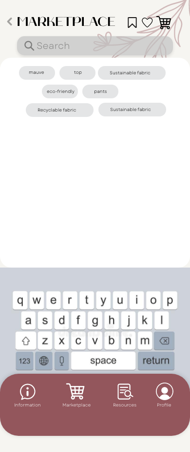
When asked to add an item to the cart multiple users had trouble finding the 'Marketplace' tab because they confused the cart icon as the cart rather than the marketplace
need to change the icon to something more universal
When asked to go-to favorite or favorite an item/brand users were confused about which icon to click the top icon or the one on the item
need to make it more clear to the user which one to click
On browser view, some pages cannot see the bottom tabs so users cannot navigate without help
Need to find a way to fix the issue on the browser view
Step 4: Mid-Fidelity
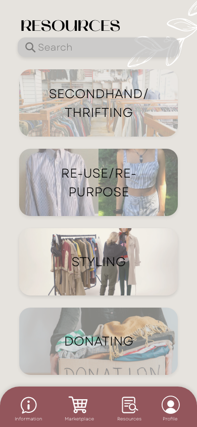
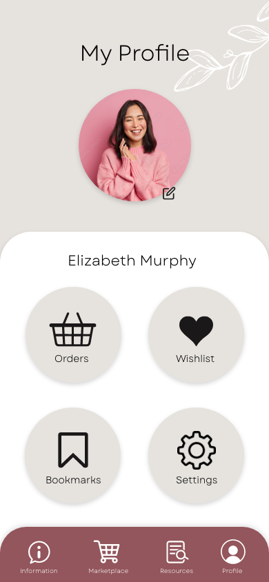
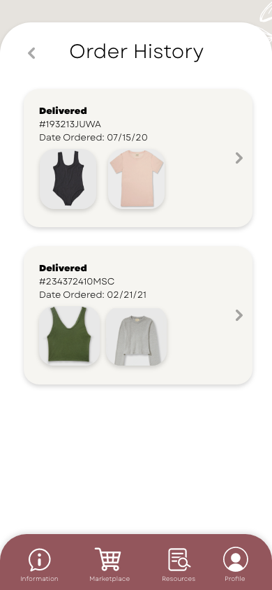
After receiving feedback from my users, I started to re-design some screens and add more elements to my app overall.
Changed the design of Information & Resources Page
Added 4 subpages for Information Page
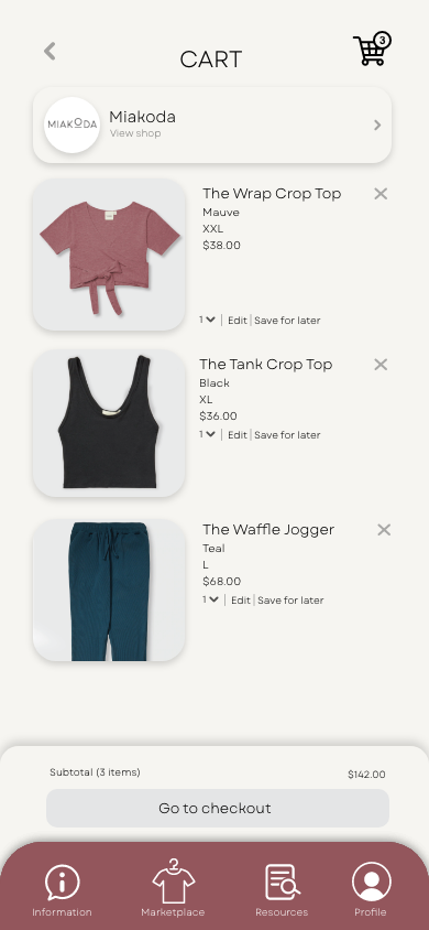
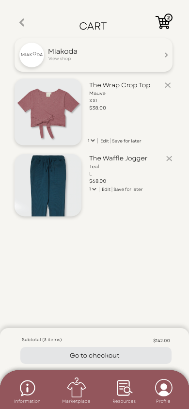
Added more items to cart
Created Styling subpage for Resources
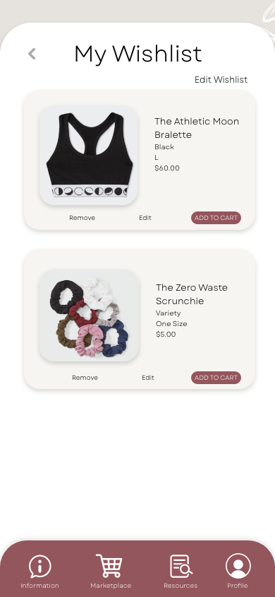
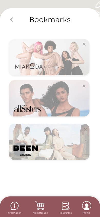
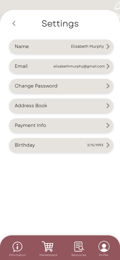
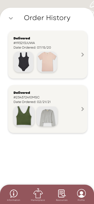
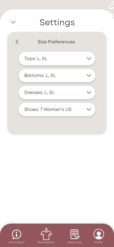
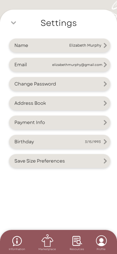
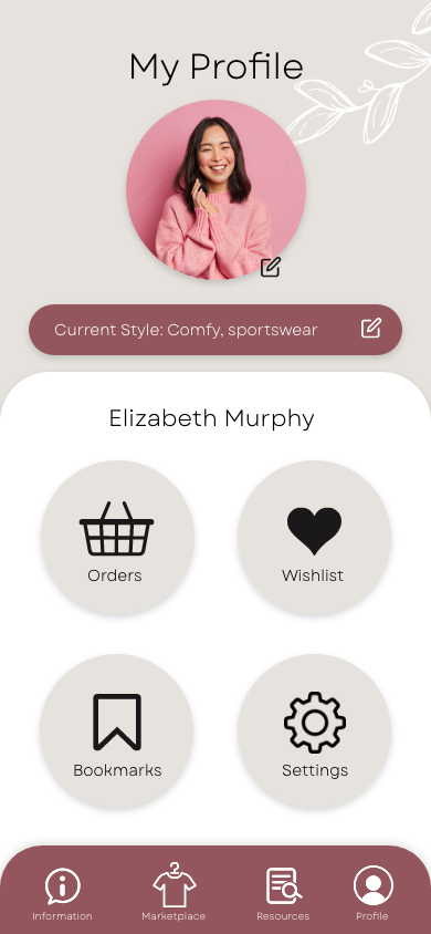
Added a profile page with 4 subpages
past orders, wishlist/favorites, bookmarks & settings

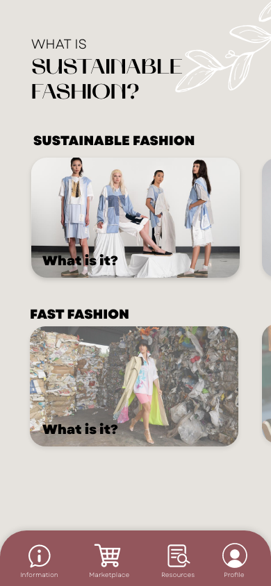


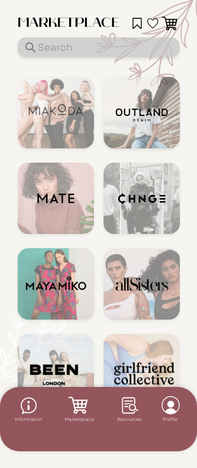
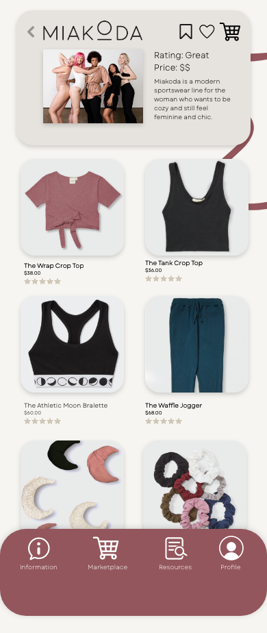


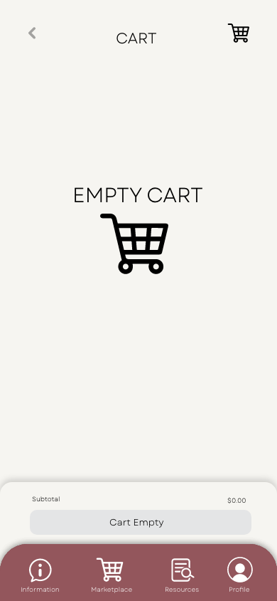

Step 5: Hi-Fidelity
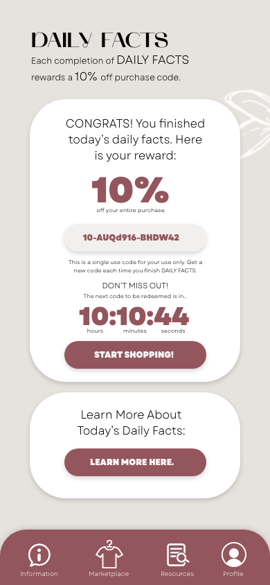
Added subpage in Information page for “Daily Facts”
Page to persuade users to read a few facts to be rewarded with a 10% discount code for their entire purchase
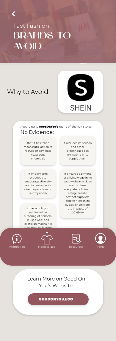
Added in the “Brands To Avoid” Page, one brand (SHEIN) to analyze and explain why it should be avoided
Reformatted infographics inside a few subpages within Information Page
Created mockup images for business cards, advertisements, mobile screen and environmental mockups








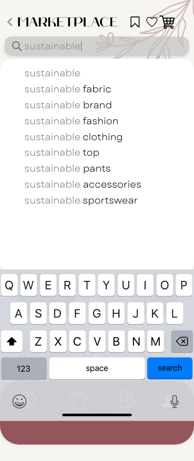


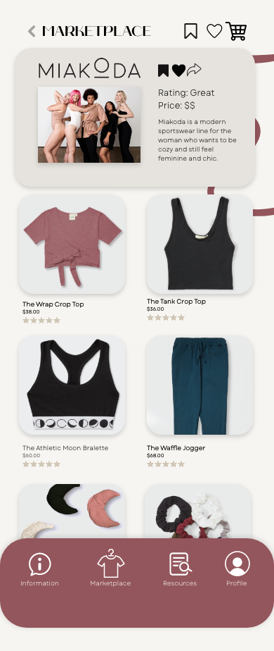
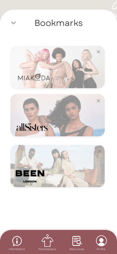
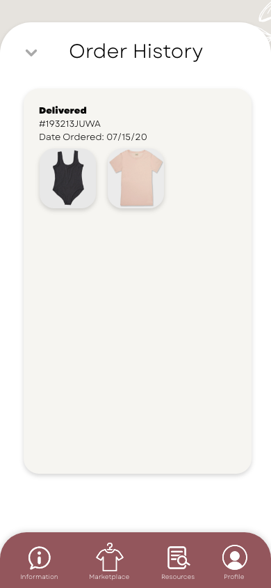


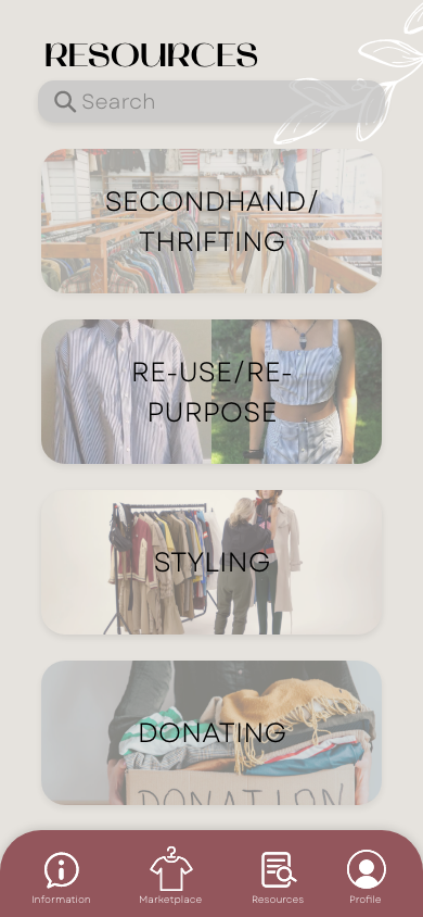
Final Mockups + Video
Mobile App Screen Mockup
Vitality Business Cards
App Advertisement Store Window
Instagram Post Mockup
3 Mobile App Screen Mockup
App Advertisement Outside Store
App Advertisement in Mall
Vitality Screens Mockup 2
Final Capstone App Demonstration
Demonstration of Vitality App


