MakerSpace Urbana
For this project, our goal was to create a new combination mark/logo, for the MakerSpace in Urbana! Makerspace is a generic term for community-operated workspaces where people with common interests in computers, machining, technology, science, entrepreneurship, arts + crafts can meet to socialize and collaborate.
Process
Step 1: Researched and studied the original MakerSpace Urbana logo
In the current logo, the type and image are not necessarily articulated and need a more cohesive approach.
Original MakerSpace Urbana Logo
Step 2: Started sketching ideas that create a more cohesive approach
I believe that the solution to this problem was to create a logo based on the idea of using a blueprint that embodies the meaning of community through the beginning of every project.
Step 3: Get feedback from classmates and professor
After narrowing down my sketches, I received feedback from both my classmates and my professor on which ones to digitize and finalize.
Step 4: Digitize and finalize logo selection
My finalized logo selection uses three different colors and uses the font Avenir Next Heavy.
Step 5: Create environmental and merchandise mockups
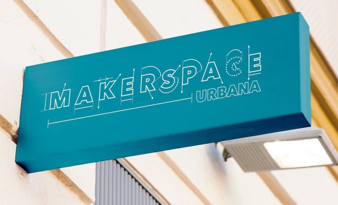
I created both environmental mockups like a store sign, bus sign, and a wall sign and merchandise mockups like t-shirts, business cards, and materials that would be used in the MakerSpace.
Logo Process
My inspiration for this logo was from blueprints and how they are used at the beginning of every project to create new ideas and make them become a reality. I played around a lot with the alignment and spacing of the letters.
After sketching and mocking up the logo digitally, I came to the decision of the final logo to use three colors and use the typeface Avenir Next Heavy because of the geometric shape of the typeface, it matched my idea of creating a blueprint where usually structured and linear lines are used.
Initial Logo Sketches
Logo Digitizations
Final Logo Specifications
Final Logo + Mockup & Applications
Final Logo
Logo Mockups
Logo Environment Application
Environmental Mockup
T-Shirt Mockup Merch
Bus Stop Environmental Mockup
Business Card Mockup
Stamp Mockup


